Design for Businesses

Design with purpose

Art Director , Brand Designer , Business

Hey! I’m
Gus Athayde

I help businesses turn ideas into clear, purposeful communication — from logos and visual identities to marketing, content and digital experiences.

Not just good-looking. Good for business.

Every design decision has a purpose.

I look at the business, the audience and the goal before I design — because beautiful is only part of the job.

The goal is to make it work.

What I do.

  • IdentityLogos, visual systems & monograms.
  • MarketingCreative designed to communicate and sell.
  • DigitalContent, imagery & SEO-driven communication.
  • Creative StrategyTurning business problems into clear creative directions.
  • Marketing
  • Art Direction
  • Presentation
  • Layout
  • Monograms
  • Logo Design
  • Branding
  • UX Design

How I think.

  1. Understand.The business. The audience.
    The problem.
  2. Clarify.What matters.
    What needs to be said.
  3. CreateThe right idea.
    The right visual language.
  4. Deliver.Something useful,
    relevant and built for a purpose.

My numbers

Logos
500+
SEO
#1 Google in
10 months
Social Media
1,580+ Instagram
creatives
Web
530+ blog
articles

Case Studies

Expandr — brand identity for a higher-education SaaS platform


Expandr spiral symbol in white on orange

LOGO CONCEPT

EXPANSION. EDUCATION. MOMENTUM. The Expandr logo combines the ideas of expansion and the Big Bang with the brachistochrone curve — the path that allows the fastest movement between two points under the force of gravity. As a SaaS platform for higher education institutions, Expandr translates this concept into a simple idea: education as the fastest path between a student and professional success.

LOGO ELEMENTS

The visual system extends the logo by using its graphic elements while preserving their original proportions and approved color palette. Curved cuts inspired by the logo can be incorporated into photography, banners and other graphic materials, creating a consistent visual language that conveys movement, expansion and forward progress.

Expandr logo elements in white on orange: a single curved arc, the spiral symbol and a gradient circle

BRAND TYPOGRAPHY

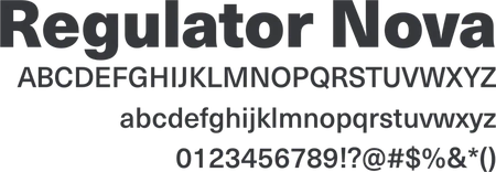
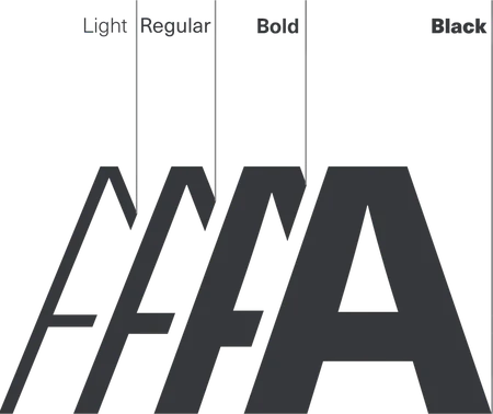
Regulator Nova typeface specimen with uppercase and lowercase alphabets, numerals and symbolsRegulator Nova weights shown as overlapping letter A shapes: Light, Regular, Bold and Black
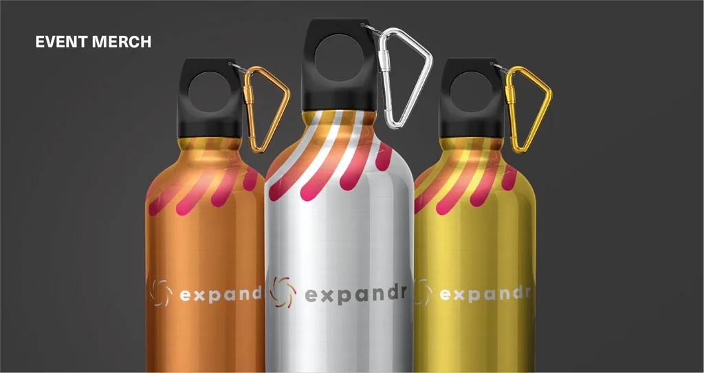
Event merch: three Expandr water bottles in copper, silver and gold
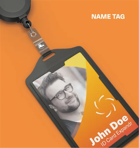
Name tag: Expandr ID card in a black holder on a retractable badge reel
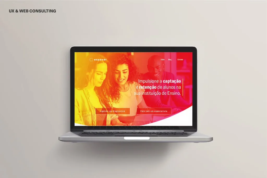
Expandr website for higher-education institutions shown on a laptop

Brand colors

  • #F28D3C
  • #E63952
  • #9A9792
  • #F4D548
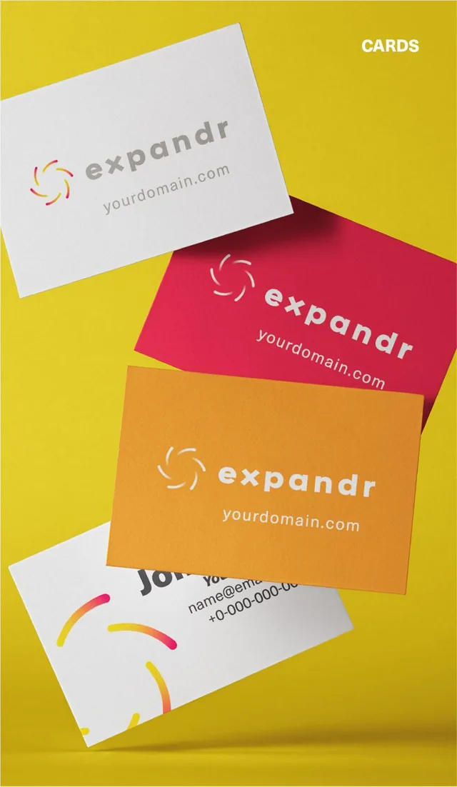
Expandr business cards in white, red and orange floating over a yellow background
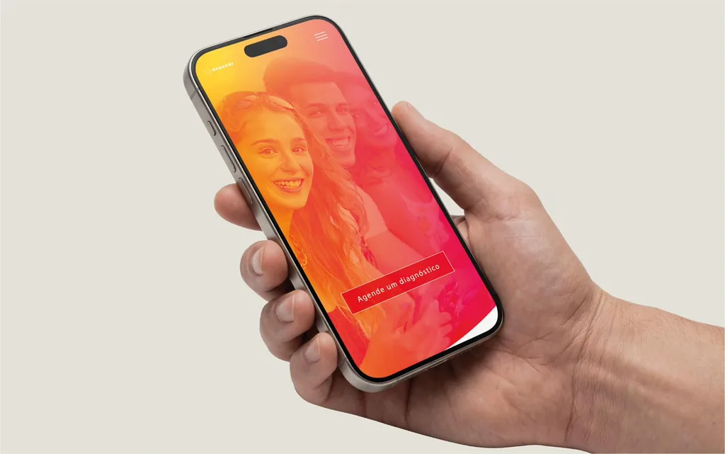
Expandr mobile website shown on a smartphone held in hand

TripleTrad — brand identity for an online translation company

TripleTrad wing-shaped T symbol in white on purple

LOGO CONCEPT

The TripleTrad logo combines the ideas of freedom, mobility and agility with the brand’s fully online and technology-driven approach to translation. The symbol is built around a stylized T shaped like a wing, representing freedom and the ability to move without limitations. Its curved form reinforces a sense of movement, flexibility and practicality, while the purple color reflects the brand’s connection to technology, innovation and digital solutions.

BRAND TYPOGRAPHY
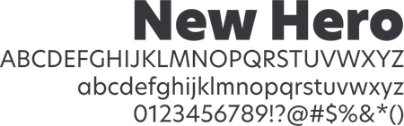
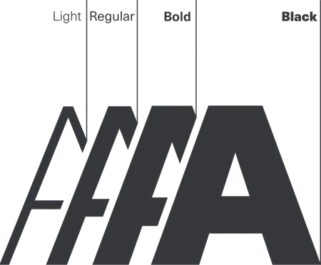
New Hero typeface specimen with uppercase and lowercase alphabets, numerals and symbolsNew Hero weights shown as overlapping letter A shapes: Light, Regular, Bold and Black
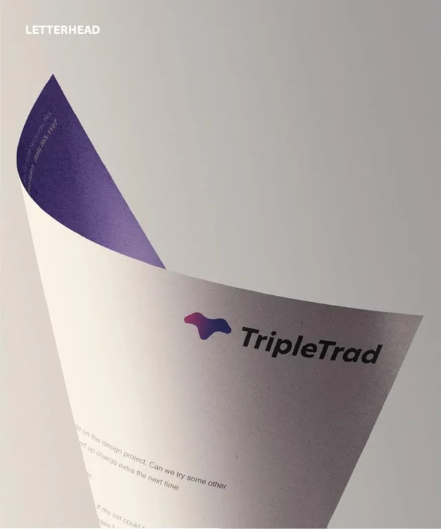
Letterhead: TripleTrad logo printed on a curved sheet of paper
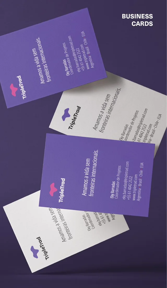
TripleTrad business cards in purple and white

Brand colors

  • #6B5EA6
  • #CD5A9D
  • #F28D3C
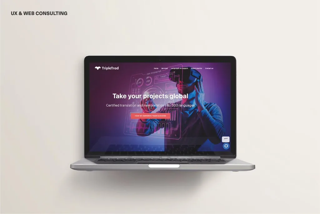
TripleTrad website homepage, “Take your projects global,” shown on a laptop
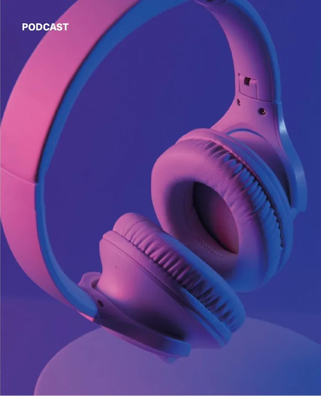
Podcast artwork: headphones lit in pink and purple
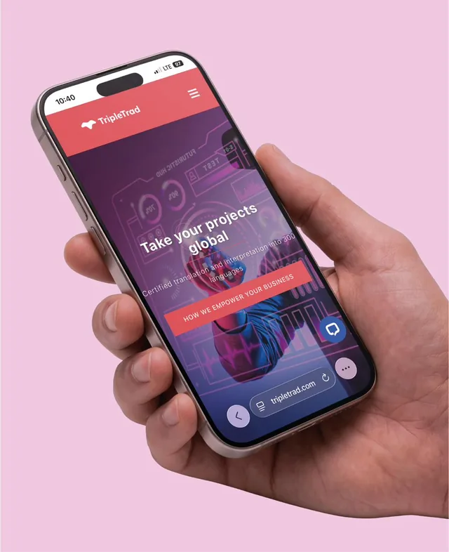
TripleTrad mobile website shown on a smartphone held in hand
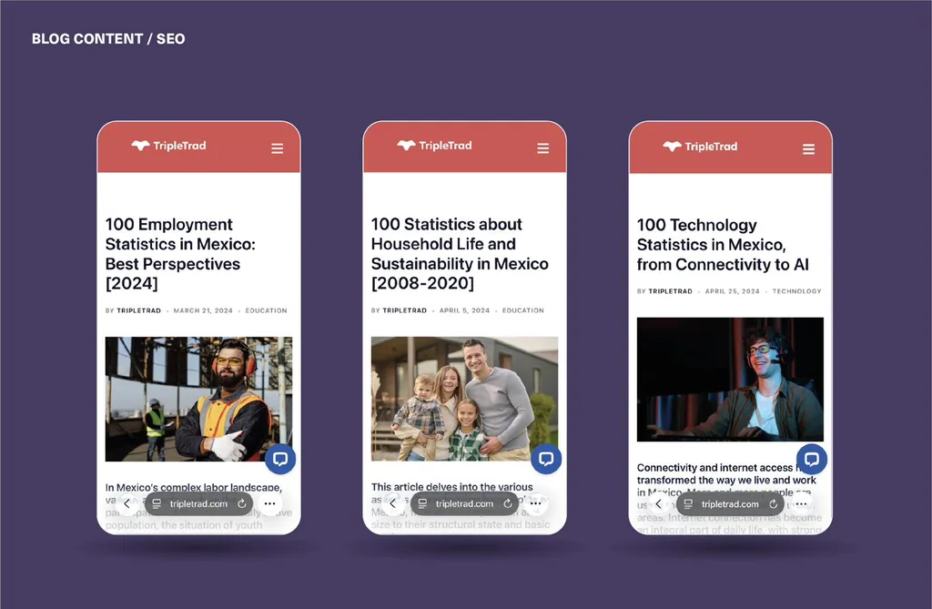
Blog content and SEO: three TripleTrad articles about statistics in Mexico on smartphones
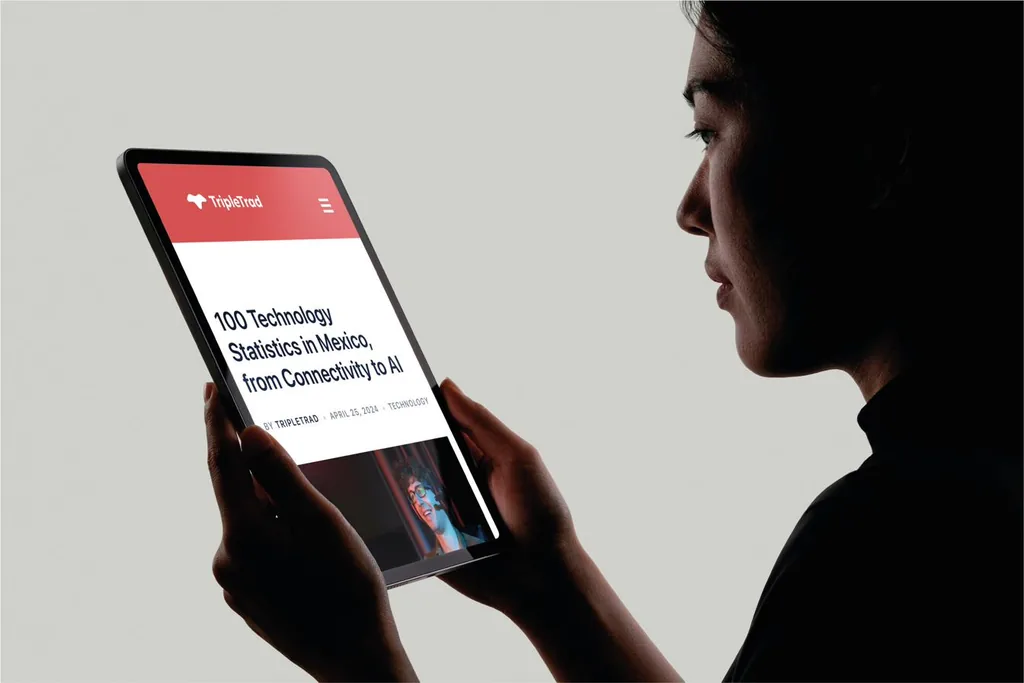
Woman reading a TripleTrad blog article on a tablet

Dona Luzia — brand identity for a healthy food business

Dona Luzia leaf monogram in white on green

LOGO CONCEPT

The Dona Luzia logo combines the initials D and L into a distinctive monogram, with the L stylized as two overlapping leaves integrated into the uppercase D. The vibrant citrus color palette reflects the brand’s focus on healthy, natural food, while bringing a sense of freshness and energy to the identity. The rounded typography reinforces the feeling of warmth, comfort and homemade cooking, creating a visual identity that feels both fresh and welcoming.

LOGO ELEMENTS

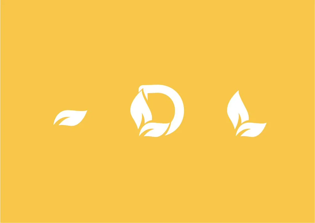
The visual system extends the monogram through the use of the double-leaf symbol and individual leaf elements, creating flexible graphic assets that consistently reinforce the brand. These elements can be used independently as a simplified version of the logo while maintaining the visual connection to Dona Luzia’s natural, healthy and welcoming character.

Dona Luzia logo elements in white on yellow: a single leaf, the monogram and a double leaf

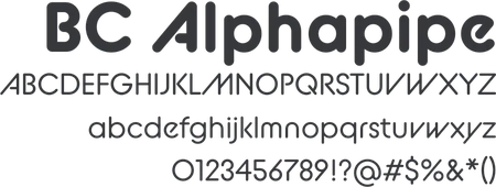
BRAND TYPOGRAPHY

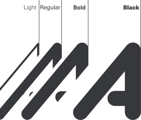
BC Alphapipe typeface specimen with uppercase and lowercase alphabets, numerals and symbolsBC Alphapipe weights shown as overlapping letter A shapes: Light, Regular, Bold and Black
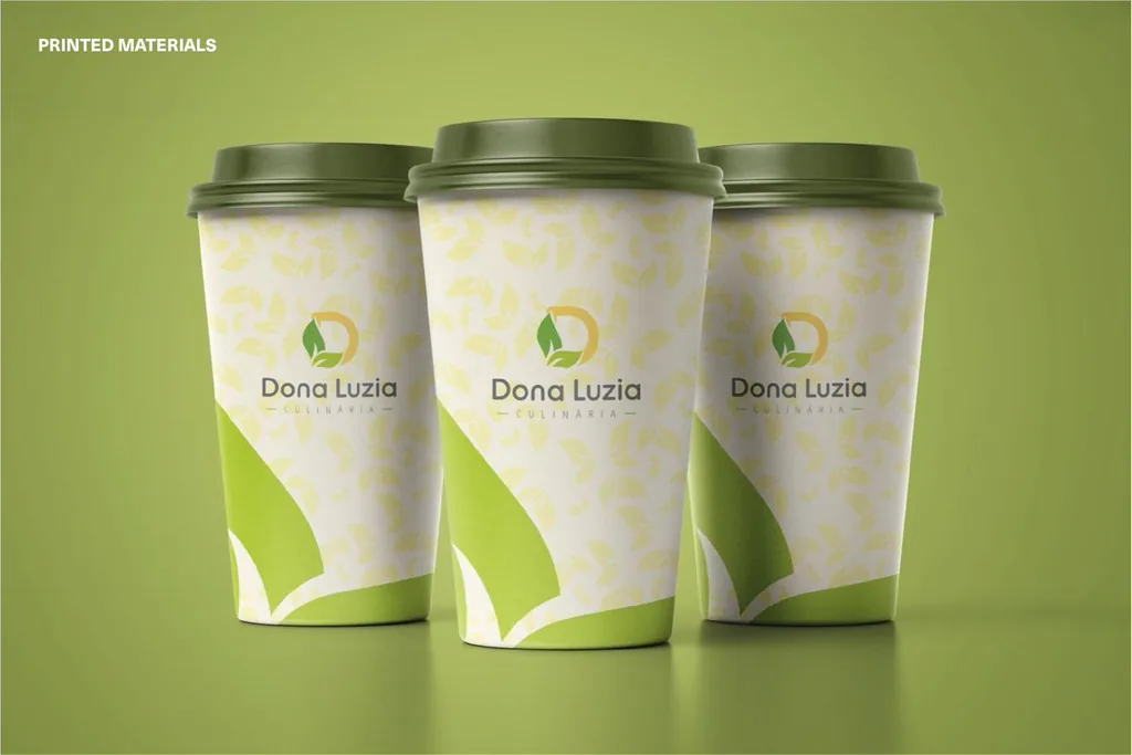
Printed materials: Dona Luzia coffee cups with a leaf pattern

Brand colors

  • #F8C849
  • #999797
  • #616261
  • #9DBC1D
  • #67A030
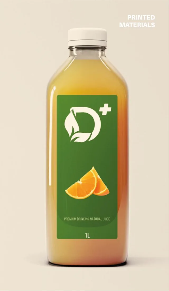
Printed materials: juice bottle with a Dona Luzia label
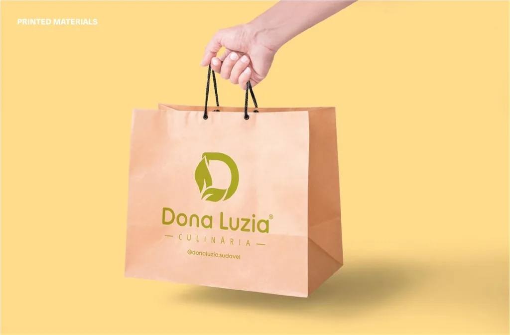
Printed materials: Dona Luzia kraft paper shopping bag held in hand
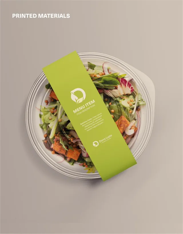
Printed materials: salad bowl wrapped with a Dona Luzia menu band
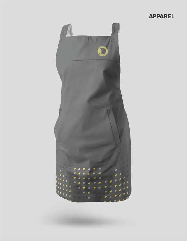
Apparel: gray apron with the Dona Luzia monogram
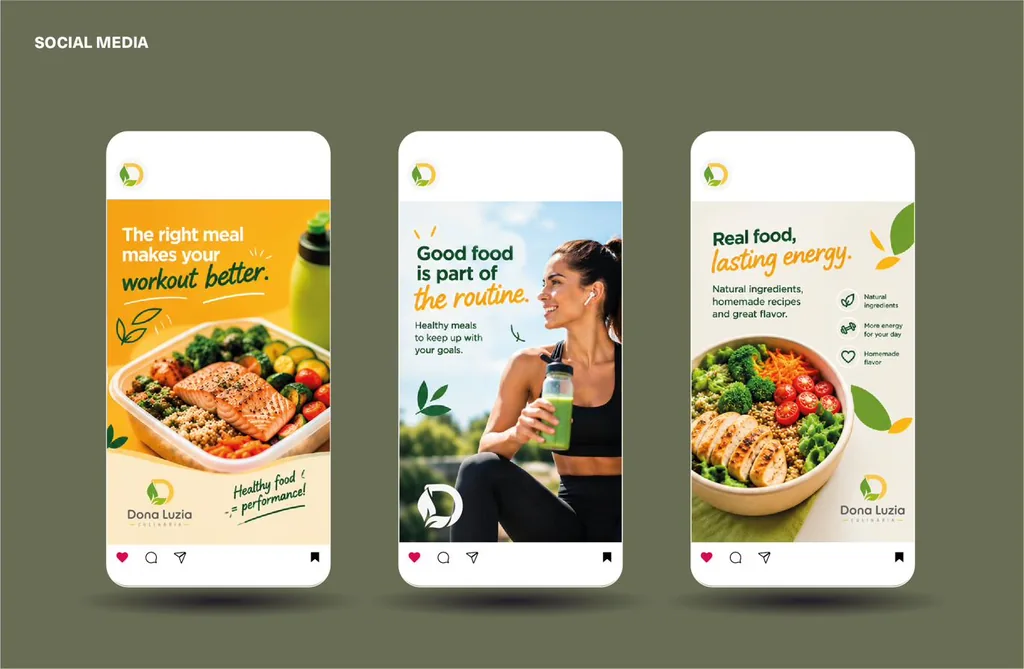
Social media: three Dona Luzia posts about healthy food

Thomas Truman — brand identity for an architecture and interior design practice

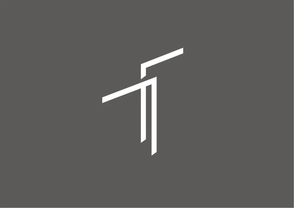
Thomas Truman T monogram in white on gray

LOGO CONCEPT

A precise signature created for a practice shaped by architectural clarity. From the studio facade to stationery and project documentation, the monogram gives the practice a cohesive and unmistakable presence.

Designed to exist wherever ideas become spaces.

BRAND TYPOGRAPHY
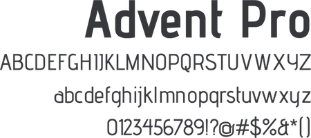
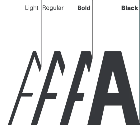
Advent Pro typeface specimen with uppercase and lowercase alphabets, numerals and symbolsAdvent Pro weights shown as overlapping letter A shapes: Light, Regular, Bold and Black
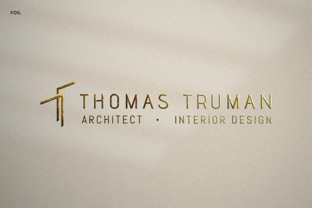
Foil: Thomas Truman logo in gold foil on textured paper

Brand colors

  • #F5F4F4
  • #5C5B5A
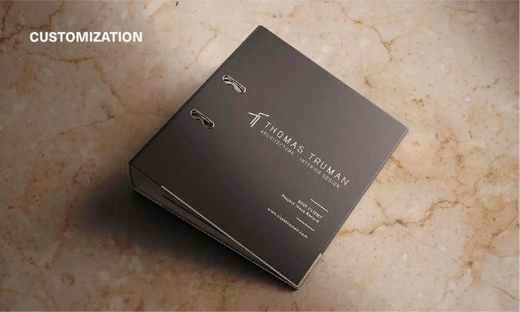
Customization: dark binder embossed with the Thomas Truman logo on marble
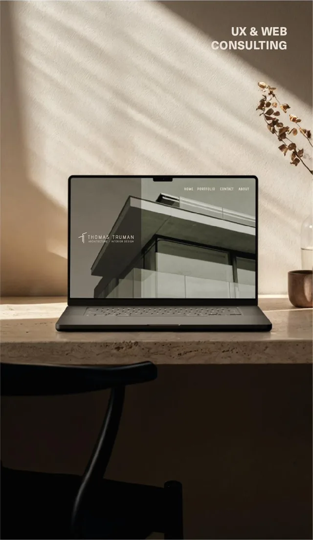
UX and web: Thomas Truman website on a laptop on a stone desk
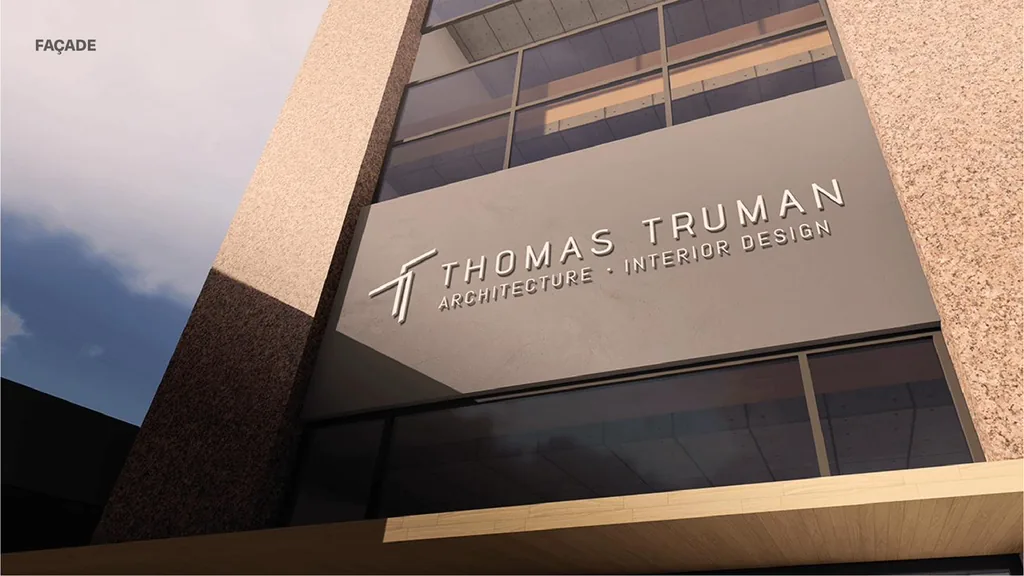
Façade: Thomas Truman logo signage on the studio building
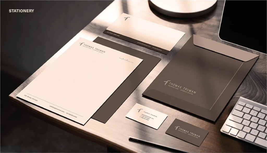
Stationery: Thomas Truman letterhead, envelope, folder and business cards

EngiMarket — brand identity for an industrial equipment comparison site

EngiMarket “em” monogram in white on orange

LOGO CONCEPT

The EngiMarket logo combines sobriety and reliability with a sense of energy and forward movement. The bold black typography conveys stability and confidence, while the orange horizontal line adds a dynamic touch inspired by engineering, construction and progress. Together, they reflect EngiMarket’s role in helping professionals compare products, make faster decisions and build better.

BRAND TYPOGRAPHY
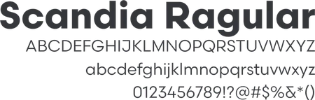
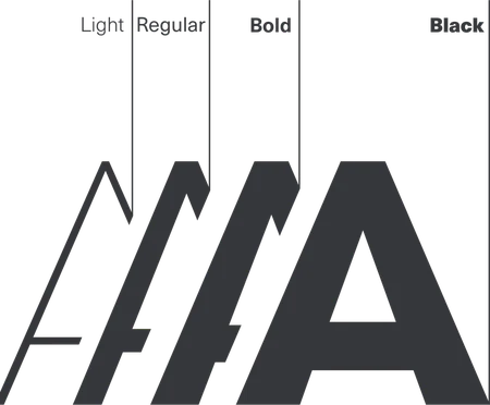
Scandia typeface specimen with uppercase and lowercase alphabets, numerals and symbolsScandia weights shown as overlapping letter A shapes: Light, Regular, Bold and Black
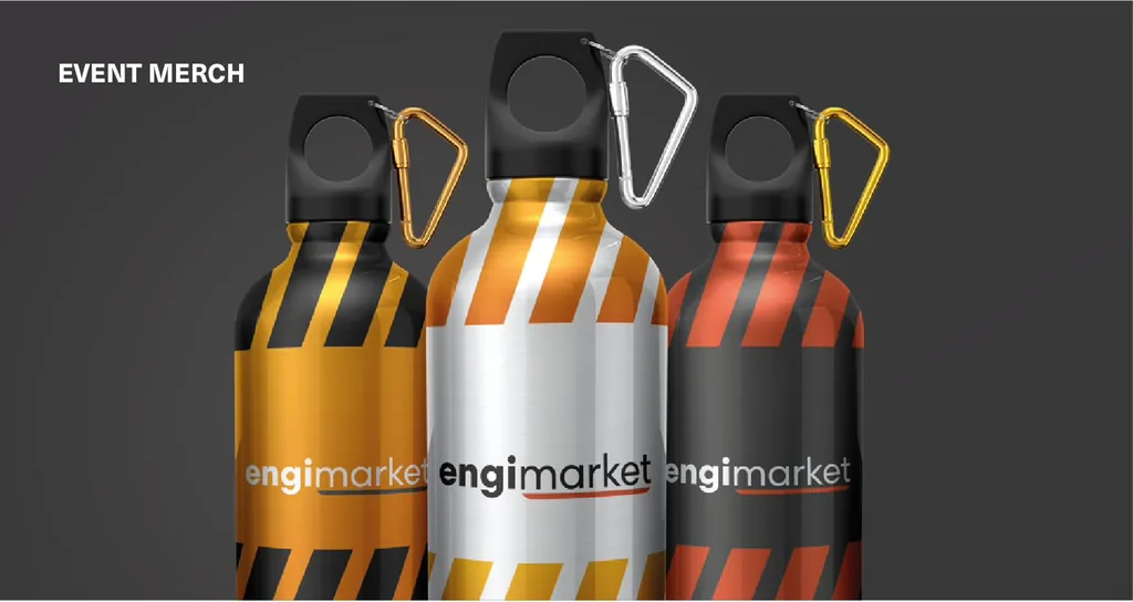
Event merch: three EngiMarket water bottles with orange and black stripes
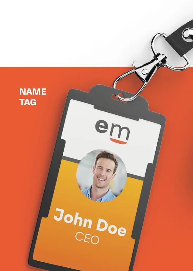
EngiMarket ID badge name tag on a lanyard

Brand colors

  • #EA5B34
  • #969493
  • #514F4E
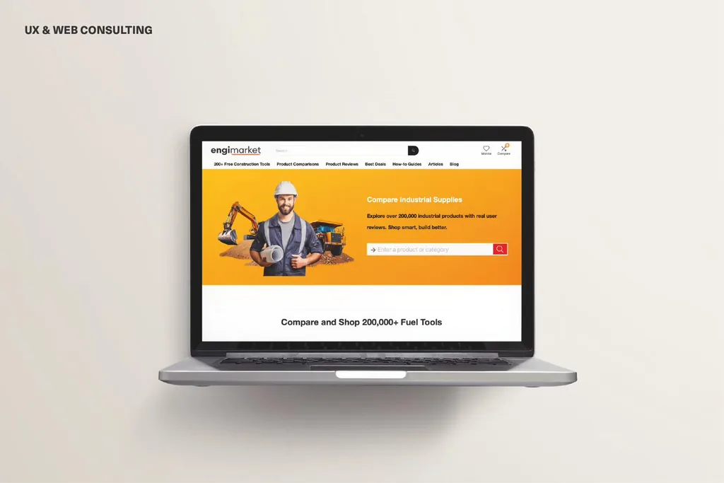
UX and web consulting: EngiMarket product comparison website on a laptop
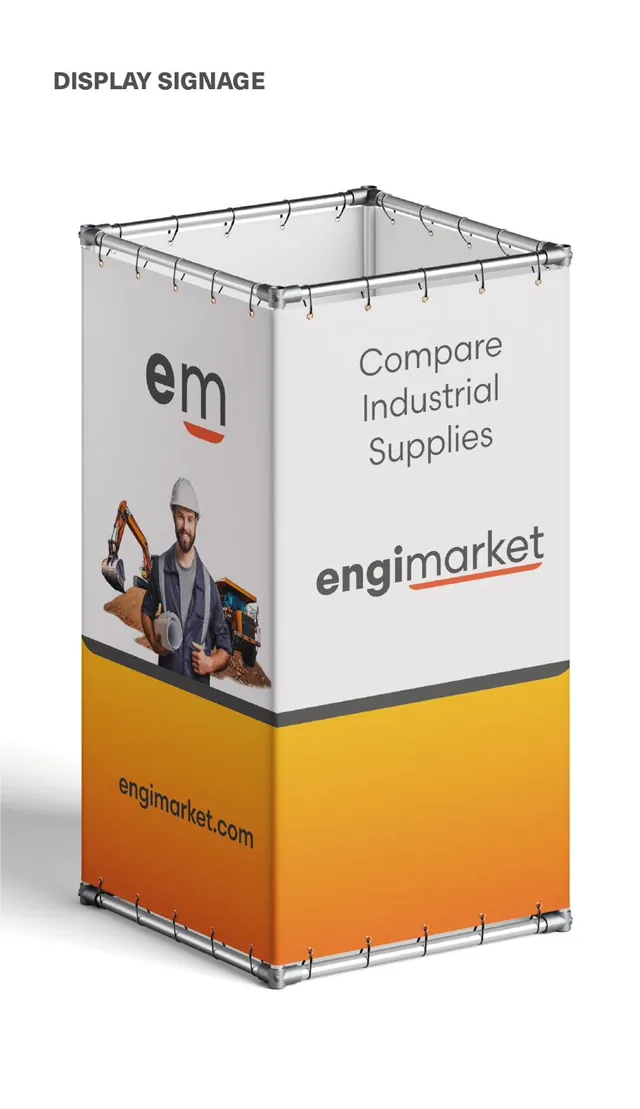
Display signage: printed fabric cube reading “Compare Industrial Supplies”
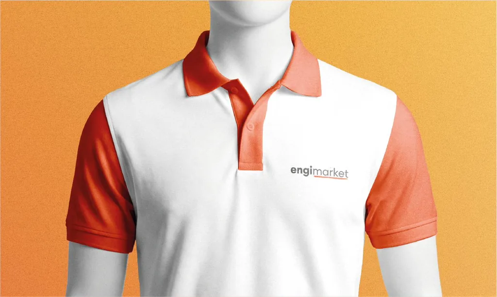
White and orange polo shirt with the EngiMarket logo
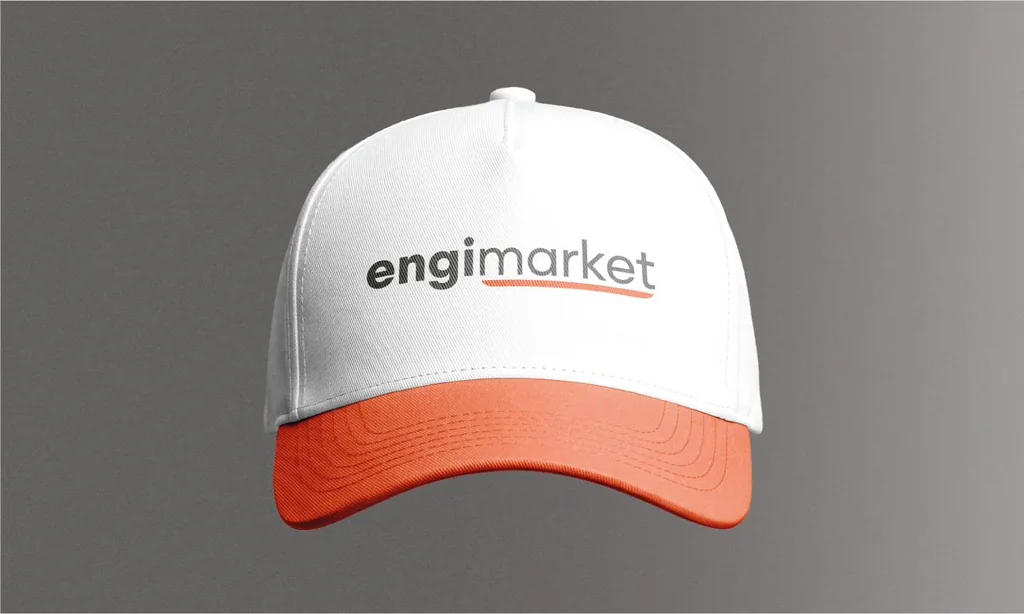
White and orange cap with the EngiMarket logo
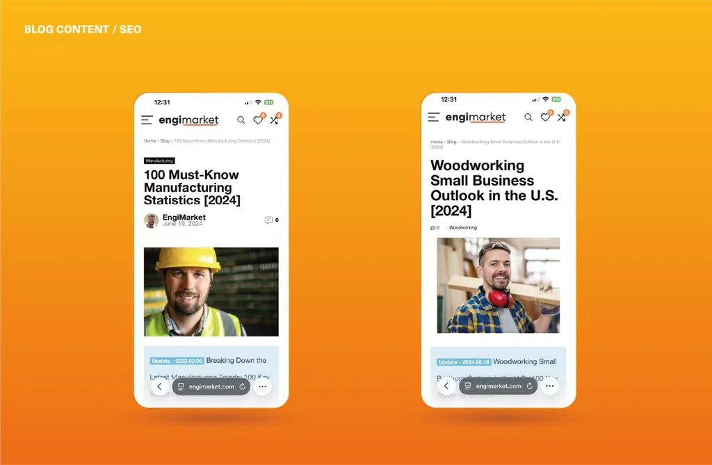
Blog content and SEO: two EngiMarket articles shown on smartphones
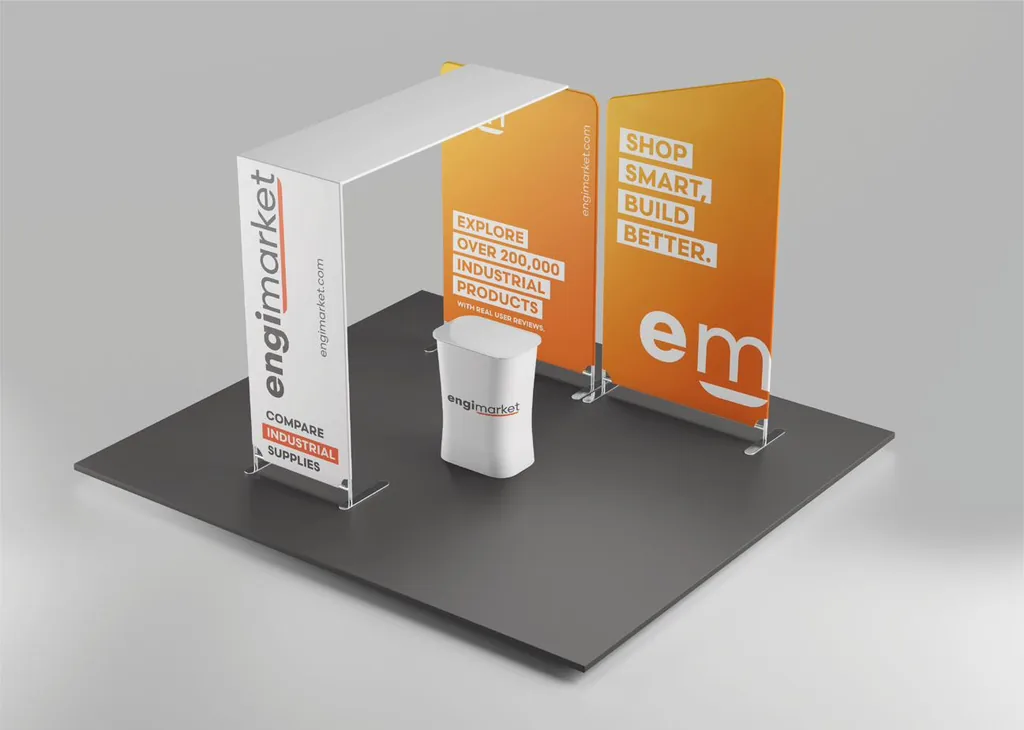
EngiMarket trade show booth with a branded orange backdrop